Posts

Showing posts from January, 2021

(B2) POSTER DEVELOPMENT

Image
To start with I increased the point size of the text surrounding the logotype in the centre It was too big to fit around the edge of the poster so, I laid it out around the logotype  I also made sure the type was white so it did not clash with the glitch double- exposure   But, then I was stuck with the issue of trying to make each of the posters connect but in a way that fits the context of the project  I reminded myself of the ideas behind our original designs which were the three- dimensional tesselations and the idea of play  I drew out a bold cubic tesselation and fit it loosely to the triangular play button I had shown it to the group and Hussaine asked whether we should make the line weight of the cubes in the social media thicker to match but, I thought it would look better with a finer line weight anyway  This idea would allow for a constant dynamic element running through each poster and the other deliverables  Then it was the issue of applyi...

(B2) GROUP DISCUSSION AFTER FEEDBACK

After the feedback with Angus, I really wanted to respond with developing our designs further. I was quite disappointed but, other groups work was far more considered than ours so I understand what he was saying. I also do not want this project in my portfolio in its current state. I expressed this to my group to see if they also wanted to respond to the feedback.  Hussaine deduced that we needed larger text across the board, more significant differences between the posters and more consideration on the flyer  I suggested making a plan and delegating tasks among us because of the tight schedules, I did not want this to overlap on my other briefs too much being a four-day brief Hussaine started reworking the social media posts so I took it upon myself to begin working on the posters, Bradley offered to do the flyer  I also said we should design some additional promotional material and present the project in a deck like Angus suggested.

PEER FEEDBACK 27/01/21

Last weeks peer feedback meeting I was the only person that arrived but, this week I was joined by Jasmine again. I spoke about how my group and I were thinking of responding to Angus' feedback from yesterday even though we had completed the brief etc. I explained to her what I had started trying out and she said she really liked my colourful vector shapes from earlier on in the initial ideas. So I should revisit that and go from there (obviously with the go ahead from the rest of my group).  I also spoke about the projects I had been looking at for some inspiration on moving forward with the Living With Borderline Personality. Jasmine really liked the Mind Matters kit too and said she can see how we could adapt our idea in the same way.  Jasmine was close to finishing one of her briefs to do with type. She was stuff on how to finalise the designs, whether the type specimens would be in a box or have a sleeve to connect five A4 zines containing the individual specimens. I real...

(B2) ANGUS MACPHERSON'S FEEDBACK

Really playful concepts, creative ideas  A lot of work in a short amount of time which is good for future work in the industry Posters look great, really cool poster. Information is too small though and doesn’t know what he’s looking at  Will have to really lean in to see what it’s for  Liked the logo treatment in the middle More could be made of it, all look too similar  Would have been nice to see it flipped. On black  He really liked the social media posts  Liked how we did the glitch on the videos and not the people  Can’t see what it’s for or about  The flyer looks like an afterthought and no consideration  Would have been nice to see on a deck  Overall, well impressed  Quality is really high  He really liked the application of the designs and the presentation that other groups had done so, it’s something we should try to do for our designs  The presentation itself it part of the design, it should be a consistent narr...

PPP TASK ONE

Part One Find two graphic design practitioners/studios you like*  *One must be local  Look at their websites! (As a collective space for their visual language/identity)  Think about their studio name, work, tone of voice, layout, language, impression, feel.  Compare the two... Part Two   Consider your own work, tone of voice, layout, language, impression, feel.  Think about how you want to present this as a consolidated practice.  Develop a succinct version of your own ‘About’ copy/text*  *Think about refining your manifesto Consider a studio name for yourself... Present Your Findings  Demonstrate your findings on the two studios/practitioners.  Show how this may be considered for your own practice.  Create a 4 page PDF   Page 1: Studio/Practioner A Page 2  Page 2: Studio/Practioner B Page 3  Page 3: Your Studio Name and ‘About’ Text Page 4  Page 4: Your Visual Language: Type, Colour, Layout, Feel!  Group Tu...

(B1) LET'S TALK - SOCIAL GOOD CAMPAIGN

Image
  The designers of this project are students at university like us and this is their response to a brief that asked them to design a social good campaign of their choice. They chose to address the mental health across the student body I think it is interesting to note how the tone is dramatically different in this campaign compared to the Mind Matters: Mindfulness project The colours, like the group explains, are meant to be comforting and inviting, whilst maintaining a narrative that this is serious - which is why I think its different to the other project. I also feel that the colour reflects the audience being at University as it is very academic in appearance, it could blend in with typical posters stuck up around university, it does not stand out as a mental health campaign  Personally, I enjoy the context of the posters however the design is a little plain, I think there could have been a lot more experimentation with the typography seen as there has been evident co...

(B1) I'M NOT OKAY

Image

(B1) MIND MATTERS: MINDFULNESS BY JESSICA YEAP

Image
  After my peer critique with Jasmine, I really thought about where to go now with the Living With Borderline Personality project with Raisa I started looking for campaigns and this project caught my eye straight away  The continuity between all the items for the kit and then the social media campaign is extremely concise, presumably because they have set out design rules early on such as; colour scheme, grid system, typefaces/styles, imagery and textures  All of the deliverables are pleasing to observe and you want to interact with it Mindfulness although simple, in theory, can be really difficult for someone struggling with their mental health. Simply getting out of bed can feel chore nevermind setting out to do helpful tasks that mindfulness usually entails  Nevertheless, this kit is not imposing in the slightest, the nice little sticker set and written prompts in the journal make it much more inviting  The concertina "A Guide To Mindfulness", uses the same i...

PERSONAL PROFESSIONAL PRACTICE BRIEFING

There are three parts to the module: Personal Branding You will be required to demonstrate appropriate preparation for your stated progression ambitions through research into self-promotion material and methods. Design Strategy  You will create a designed PDF which will compile key learnings and evidence your career-specific activities. For example: records of professional correspondence, enterprise plans, contacts, a reflective skills evaluation and a current CV. There is an expectation for the design strategy PDF to be harmonious with your personal branding, underlining the clear vision for the way you’ll present yourself in a professional context. Research Journal  Your blog will be used to journal your research, development and management of PPP. This will include a record of all your activities along with ongoing evaluation and reflection of your progress, documentation of research undertaken, and a summative evaluation of your project. Assessment & Submission Require...

PEER FEEDBACK 13/01/21

Unfortunately, only two of us turned up to the peer critique meeting however, Jasmine gave me a lot of good feedback regarding the Living With Borderline Personality brief. Raisa and I have both been busy with other assignments such as Context of Practice and then Curate.TV. I am disappointed to have not done a lot over Christmas, however, I know I needed a break and rather than force myself to do it, I thought it best to look at it with fresh eyes. I also think we were ready for some critique outside the pair of us, so the feedback is not bias.  I explained the brief first and then shown Jasmine what we had produced so far. I had mentioned that I am not sure where to go from there because the styles are both really different and I need to find a way to bring them together.  Jasmine suggested making the designs even more different, like a colour change for example. Or even having a small paragraph explaining the concept at the beginning. I remember Simon suggesting we make it ...

(B2) DESIGN BOARDS

Image

(B2) FINAL DEVELOPMENT / OUTCOMES

Image
SOCIAL MEDIA POSTS   Hussaine went back to his original videos and changed the backgound to black. However, that made the cube just blend into the background rather than look like an actual cube I suggested adding some thick white linework, similar to the original tesselation sketches that had thick black linework  Hussaine worked on that suggestion and also added some of the textual information that was required for the posters and flyers  The video looked far more professional and all that was left was for me to add my glitch effect We had two of these videos as each cube had three of the six videos on it, plus we needed three social media posts  Hussaine went on to design a third social media post that would be the same cube however, it would display the speakers on it rather than the videos. We decided not to add the glitch effect to that video because we wanted the audience to be able to read the text and see the imagery POSTERS Hussaine also edited Ryan's poste...

(B2) GROUP DISCUSSION / CRITIQUE 3

Image
The group really liked the videos with the glitch effect so we will definitely be carrying on with that concept  I asked about the legibility of the type and whether the glitch should be every now and then or continue glitching the entire video The group said they preferred the idea of the glitch continuing throughout, the caption will display the rest of the information Out of all the poster development from the others, we said that Ryan's were the most engaging and would go with the social media videos really well However, we actually thought the black poster (to the right) was the best and most effective for the brief  But, the videos have a white background, so Hussaine and I sort to edit that and develop the videos further  As for the flyer, I was aware we still had to make a start on it and that we were running out of time  I suggested that Bradley and Olivia have a go at the leaflet as Ryan, Hussaine and I were working on the posters and social media posts...

(B2) GROUP MEMBERS FURTHER DEVELOPMENT

Image
 BRADLEY GOMERSALL RYAN SCURFIELD OLIVIA SCOTT

(B2) GLITCH EFFECT ON THE VIDEOS

  I applied my glitch overlays and warped the original videos frame by frame  I was really happy with the results but there was still a lot to consider Would the legibility be an issue? Or because these are for social media the information could be in the caption?  I will see what the rest of the group think but, overall, I think the glitch with the cube works effectively

(B2) MOOD BOARD

Image
  I devised a small mood board to refer back to so I can make the glitches in the videos look realistic. Also, others in the group can use it to make sure their work fits in with the theme also

(B2) GROUP DISCUSSION / CRITIQUE 2

Image
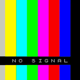
Ryan and Hussaine first spoke of how we could improve/ develop the cube net flyer to have more legible type and chose a particular colour scheme Ryan suggested that we use one colour and change it for each tile on the net  Hussaine suggested primary colours again because it has a woodblock aesthetic (are usually primary colours) Referring back to my ideas and research, I suggested maybe using the most occurring colour from each video as one of the colours for each tile  I brought up my posters and development and how it was a little more stripped back than the other stuff and used the primary colours that Hussaine had suggested  He asked why I had done the glitch effect and I explained it was to reflect the act of playing and disruption in video  Hussaine said it reminded him of the no signal page that used to come up on the TV and found the concept interesting and it followed a primary/ secondary colour scheme  Bradley really liked the idea moving for...

(B2) GROUP MEMBERS DEVELOPMENT

Image
 HUSSAINE RAOUI Hussaine mocked up his tesselations into a cuboid net, we all liked it but agreed that it just looked like the antichrist cross rather than a net  But when he added the flaps at the sides it did not look very effective  We wanted to continue with the three- dimensional tesselation though so, it was a case of us working together to find a solution to the design problem we were facing  Hussaine suggested we stripped back the idea and try to simplify it  Ryan also suggested the type would need to be laid out differently for legibility purposes  As I mentioned before, I had suggested to Hussaine that he try and apply the videos to the cube-like seeing different screens play rather than just a cube  This was the initial outcome of that, using the original pink cube as a template This is the result with all the faces containing a video (the videos are playing, I just could not put the actual video on the blog

(B2) THREE- DIMENSIONAL TESSELATIONS DEVELOPMENT

Image
  After our discussion around three- dimensional tesselations, I wanted to try drawing some in the same sort of style I had begun within my initial ideas, using block colour and bold 2 point line weight I used primary colours again for the same reason, I did with my poster, as they were the most re-occuring colours throughout the videos  I used cuboids, prisms and cylinders, as each was seen across the videos. I repeated each tesselation six times to reflect the six videos Earlier in the discussion, Bradley and Hussaine had spoken about the act of playing, rather than the videos themself So I applied some effects that made me think of playing, like disruption. The glitch and chromatic aberration, are heavily associated with disruptions in videos etc.  Instead of applying them into a poster straight away, I posted these onto the drive so the group could give their opinion before continuing.  I personally really liked the outcomes and considering the current Covid-19 s...

(B2) POSTER MOCK UP USING VECTOR ILLUSTRATIONS

Image
  (Figure 1) Type provided in the Curate.TV brief pack (Work Sans Black and Regular) (Figure 2) The grid from the first and second video, using the same bold linework as the video did (Figure 3) Hat and mask saw in Grace Jones - I've Seen That Face Before (Libertango) video (Figure 4) Cuboids from the set design of the first video and black and white to represent tunnel characters drive-through in the second video  (Figure 5) Two cylinders to represent the batons or rolled up magazines the people dancing were holding in video four (Figure 6) The lines and two grey rectangles is meant to look like the paper wall when fixed in video five  (Figure 7) The red circle that is seen frequently in the sixth video  Using the vector illustrations I had drawn previously, I tried to bring them all together to form one image that translated all the featured videos. I simplified the colour scheme to only the primary colours which were present in every video. The bold linework was i...

(B2) GROUP DISCUSSION / CRITIQUE 1

We first discussed the videos and how odd they all were  Suggestions around movement, change, interaction and a 90's theme were mentioned  I explained how the only links I could really tie between the videos was colour and shapes  The group were unsure of how we move forward because the videos were quite difficult to understand   When it came to discussing everyone's initial ideas, we all had quite different approaches  Hussaine had some very playful ideas that really explored this idea of play which the group and I thought worked effectively for this brief  Isobel brought up the idea of shapes again, using them to form a typeface that would fall apart across each poster. Referring the idea to how children use woodblock shapes to make something, to figure something out, similar to us trying to understand the videos from this Hussaine suggested we looked into using three-dimensional tesselations  All of our sketches and visuals were saved onto a sh...

(B2) THE REST OF THE GROUPS IDEAS

Image
 HUSSAINE RAOUI  BRADLEY GOMERSALL

(B2) SHAPE AND COLOUR VECTORS

Image
The whole group came together and we discussed what initial thoughts we had about the videos, the consensus being quite confused as the videos are extremely strange and are so contrasting We thought it would be better to carry on individually for the rest of the day and group discuss tomorrow to see what initial sketches everyone can come up with Looking back on my video notes and referring back to said videos, I tried to find a link between all of them, that we could use as the basis for the campaign, a way to brand all six videos This was particularly difficult so, I stripped the videos back like I would a piece of design. What uses of shapes, grid systems, typography, colours are being used in the videos The first video  Triadisches Ballett von Oskar Schlemmer - Bauhaus was particularly inspiring with its artistic use of shape, colour and cubic grid systems I continued to search for the same characteristics throughout the other five videos, noting them down as simplified vector ...

(B2) VIDEOS

Image
EMILY FORGOT Triadisches Ballett von Oskar Schlemmer -  Bauhaus Interesting use of space and colour with regards to the costumes and dancers  The settings make the use of yellow, pink, black and white often in contrast to the multicoloured costumes  An array of shapes and grids are seen throughout the video, changing with each scene. Some are used as props and others are more of an addition to the background It was the shapes and colours that stood out to me the most in this video  Cubes, circles, lines LYDIA RAGHAVEN  Amaro and Walden's Joyride Definitely the most entertaining out of all the videos A music video so, something I found a lot more engaging  The use of illustrated characters within a video  A lot of use of shape and colour again in this video The characters drive through a tunnel and it is similar to the cuboid setting in the previous video MARYLOU FAURE Grace Jones - I've Seen That Face Before (Libertango) Another music video Very artist...