Posts

Showing posts from February, 2021

TASK THREE: SELF INITIATED BRIEFS

Image

(B1) FURTHER MOOD INDICATOR DEVELOPMENT AND DISCLAIMER SHEET

Image
We both liked the idea of having a two-sided card however, Raisa mentioned that the negative space where the colour key looked odd  She suggested to add arrows to point at each individual mood, this then utilised the space better  I had mentioned the difficulties I had with designing the bracelet packaging and Raisa came up with this idea of using a tube.  At this point we were having to consider mocking the designs up so, practically how would these designs fit into a box etc. I went on to design the tube. Drawing the basic form in Adobe Illustrator and adding textures, highlights and shadows in Adobe Photoshop. I want to stay away from using mockups online and using our own so, I think this technique may work for presenting the final kit I realised that a lot of the topics discussed in this kit are very sensitive and may be damaging to certain individuals. To try and warn the users, a small disclaimer sheet will be placed above all the other items in the kit I am assuming the bow wil

(B1) FURTHER ZINE DEVELOPMENT

Image
Raisa and I decided to go with the central composition for the text as it fell more in-line with both sets of cards in the kit. It also kept the continuity so it looked like part of the kit still. I had to tweak a few of the abstract designs as the text bubbles were covering a few of the more detailed parts of the patterns  For symptom 008 and 009, we both changed those because we had better ideas now after seeing all of the designs together We had chosen in the beginning to design the 'rage' together and it was not until now that we started designing it. Using the coral colour from the logo, we distorted black shapes to end up with this strange smashed mirror looking pattern. The arrow from the logo was also distorted to cause further chaos on the page The second page of the zine has the general definition of borderline personality disorder and the final page will have the useful links listed

(B1) MOOD INDICATOR SHEET DEVELOPMENT

Image
I kept to the style Raisa had used for emotion and support cards but made the card portrait and larger. Just so I could fit all of the relevant information without reducing the point size of the type.  My first idea is very similar to the cards however, I felt the extra information on the second idea was needed to explain the purple and white bracelets. Both Raisa and I preferred the vertical colour key which led to the third idea, to have it two-sided that combined a mix of both idea one and two. I went on to design some basic packaging for the bracelets, starting with a simple band to a more complicated structure None of these really stand out for me, I think they look far less considered than the rest of the kit and in doing so will make the whole thing look unprofessional.  In our next meeting, I will ask Raisa what she thinks. I do not want to spend any unecessary time on this but, I also want it all to look continuos and professional. 

(B1) ZINE DEVELOPMENT

Image
I had really struggled before to bring our abstract designs for each symptom together. With the new style, it was easier to apply the type and colour palette.  I tried a few styles of the assets we had designed across a few of the pages. The front cover remained minimal, I did not feel it necessary to overdesign it and ultimately disrupt the uniformity.  The black and white were very stark compared to the emotion and support cards so, I used the logo to add a hint of colour to each page. I also like how it ties each symptom together. As mentioned previously, a lot of the symptoms overlap or become a result of another so I felt that the arrows helped show this.  I did like the inconsistency of the text layout however, it would not conform to the rest of the kit and may become lost in the abstract design below it.  To make the concertina to work, there had to be an equal amount of pages but there are 9 symptoms. Even when I added a front and back page, the sides would be an odd number so

(B4) INITIAL SKETCHES

Image
I had a few ideas in mind for the cover of The Uninhabitable Earth and sketched them out so I would not forget them  I usually struggle to do this because I feel the need to perfect a preliminary sketch and end up wasting time (which I did start to do with these, so next time I will use a pen) The first one is meant to look like the statue of liberty buried in sand in the ocean. I would do this as a vector illustration with some grainy texture (imitate the sand). But, I would have to research and make sure that the statue of liberty would end up submerged otherwise it would not make sense.  The second layout design is meant to be a fade photograph of a fallen chain link and sign- giving an almost post-apocalyptic feel. It will probably be difficult to develop this in a realistic way as I do not have the resources to recreate the image for a photograph.  The small triangle net structure sketch is just an idea I had inspired by Fuller's geodesic domes. I want to experiment more with

(B4) BUCKMINSTER FULLER'S GEODESIC DOMES

Image
  When I read the title of The Uninhabitable Earth, I immediately thought of Buckminster Fuller's geodesic domes, specifically how he applied them to his "Save our cities" poster which was part of a six anti-pollution poster series. It depicts how some cities will become so polluted they will end up uninhabitable which is the same concept explored in this book by David Wallace- Wells. I think it will be interesting to apply the dome to the earth to show the "uninhabitable" idea. Fuller's domes are known globally and will draw the audience in. It could be a really beneficial design concept for the front cover of this book.

(B4) FORMER PENGUIN BOOKS WINNERS

Image
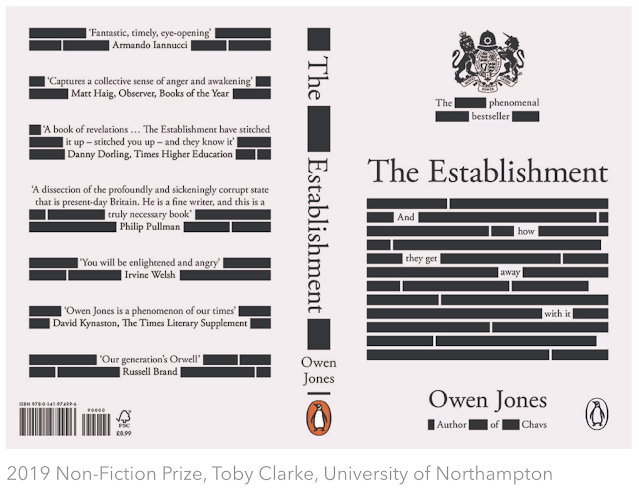
I took a look at former winners of the Penguin Books Competition to see what common design features have been used and the sort of type experimentation that they have done. I specifically selected these three to look at because some of the contexts are similar and they are all winners of the Adult Non- Fiction award which is what I will be entering.  I really like the design of this book, you immediately understand the concept even if there was no textual information at all. The design is extremely well considered, through the typography and the imagery even though it is quite minimal.  The typographic design on the front cover is really smart and very well applied to the back end quotes.  It would be good to try and translate this to The Uninhabitable Earth, using points from the book to come up with a smart and professional design The context of the book is completely different to The Uninhabitable Earth however, in the same vein, the numbers that scientists kind of throw out there t

(B4) THE UNINHABITABLE EARTH: LIFE AFTER WARMING

I intended this to be a short brief so, I will not read the entire book before the set deadline, however, I may read it (for personal use) alongside other briefs and change the design if it does not work. I will be looking at the key topics explored in the boo to gather an overall idea of the narrative.  BLINKLIST'S BREAKDOWN AND SYNOPSIS OF THE BOOK This website broke down the book into nine key points: The Paris climate agreement's goals are optimistic.  The destructive effects of climate change act as chain reactions, triggering further warming.  Severe weather conditions are becoming the new normal.  Rising sea levels will flood entire cities and countries. Runaway warming will cause mass hunger and malnourishment.  The warmer it gets, the more disease there will be. Plummeting air quality is suffocating us.  Freshwater is becoming an ever-more scarce resource. Human conflict increases on a hotter, dirtier globe.  New technologies give us ways of softening these disasters,

ROB WATSON

Raw studios -  Company is called RAW after his initials  He made a personal branding device that was a raw meat pack filled with promotional material  He started his career working for a small design studio and found that he learnt more from that experience because it meant he had more engagement and a more important role than he would have in a larger studio. Set up his studio in Salford, which they had spent time making into an amazing creative space. His friend painted a large mural across one of the walls, they had a bear carved out of wood in one corner and then a fireman's pole. A place where creativity could flourish.  had a large bear carving, mural and fireman's pole  There was a time where he and his business partner had planned to expand, across the country and abroad then later sell. However, Rob decided that plan is not what he wanted for his business or career. He bought his partner out and became the sole leader of the studio of ten staff. It came later that he r

(B4) WRITTEN BRIEF

 >> Screen shot brief  I chose this book because I mentioned in my Statement of intent that sustainability and the environment are very important to me. This year I wanted to explore different projects that involved sustainability, even if it is merely by association like this.  As designers, we should be looking for clients and work that help support sustainability or things like this book to educate the masses of the importance of sustainability. This is one of the projects that I would consciousness chose to design in the future regardless of the pay.

(B4) PENGUIN BOOKS BRIEF FROM WEBSITE

Submissions deadline extended to 23 March 2021 Adult Non-Fiction Cover Award The Uninhabitable Earth: A Story of the Future by David Wallace-Wells 'In crystalline prose, Wallace-Wells provides a devastating overview of where we are in terms of climate crisis and ecological destruction, and what the future will hold if we keep on going down the same path. Urgently readable, this is an epoch-defining book’ –  Guardian  Without a revolution in how billions of humans conduct their lives, parts of the Earth could become close to uninhabitable, and other parts horrifically inhospitable, as soon as the end of this century. In his travelogue of our near future,  David Wallace-Wells  brings into stark relief the climate troubles that await – food shortages, refugee emergencies, and other crises that will reshape the globe. But the world will be remade by warming in more profound ways as well, transforming our politics, our culture, our relationship to technology, and our sense of history. I

(B3) RECIPES

Image
 

ARTICLES ON SOCIAL CONCIOUS DESIGN

Image
A huge part of my own personal professional practice, is being a socially cocious designer. I have stated this in my statement of intent and my manifesto because it is something I am incredibly passionate about. I wanted to look at articles and talks relating to sustainability and social concious to see how creatives respond to this in industry.  What is "Visual Sustainability", and how can designers challenge power through form? - Meg Miller (AIGA) https://eyeondesign.aiga.org/what-is-visual-sustainability-and-how-can-designers-challenge-power-through-form/ This article is about ecology and environmentalism and where these intersect with design. The writer, Meg Miller, approached Crippa after seeing the course ( “Quantum Thinking: Sustainability in and Through Visuality.” )she ran and her use of the term "visual sustainability" and what that meant. Benedetta Crippa is an Italian designer, who works as a lead designer at Stockholm Environment Institute (SEI) Her wor

(B3) BRIEF CHANGE - HERBAL TEA

Image
  At the beginning of the year, I had spoken to a group of illustrators to collaborate with me on a brief I had written called “Who is your villain?”. Since, the completion of the Context of Practice 3 and reflection of my Statement of Intent, I realise now that some of my briefs are just not suited to my own practice and design style. This brief was one of them, initially entailing the illustrators to design their own fictitious villain and several facial expressions for a double-page spread. I planned to do my own character and then design a publication for print to compile all of the illustrations. Unfortunately, due to Covid- 19 and other complications, many of the illustrations found they could not commit to the project and had to drop out. I also thought about how I am much more interested in screen/ product/ and packaging design and smaller publication as opposed to large scale publications like this one.  With my remaining collaborators, we spoke of different interests we have

(B1) RAISA'S MOOD CARD DEVELOPMENT

Image

(B1)TALK WITH ME IDEA

Image
I have explained a lot of the design choices above but in general, I think this approach is much more soft and comfortable than before.  The colours are inviting but, also remind you that this is a serious conversation  I am yet to figure out how we can tie these to the zine however, I will speak to Raisa and show her these ideas and see what she can think of.  I also had a little go at designing a logo for the kit which I ended up naming 'talk with me', I think it shows the users that this will be a back and forth conversation and not just one person talking at another etc (hence the arrows), I will ask Raisa to have a go at developing the logo especially because I do not really know what to do with it, plus I know it is something she is really good at  Finally, the typeface "internet friends", seemed really appropriate for the design. It is rounded, soft and has a hand-rendered look about it. I like this idea of speech bubbles (typically social media bubbles) becaus

(B1) SIGN-UP TUTORIAL

Image
I think I had lost a lot of motivation for the Living with Borderline Personality project. Hitting the wall with the designs really slowed my stride and with it being a topic really close to home it was hard to get back into it.  I used the sign-up tutorial to try and have some clarity on what to do moving forward. I knew I had the ideas, it was more about gaining a little confidence to try them  I explained the whole project to Simon and what we aimed to do with it. I said I was not sure how to make the whole kit uniformed without looking extremely harsh with the black and white colour scheme. He agreed and suggested I try looking at other palettes that will consider the purpose and target audience more This is a kit for people with BPD to use with a family member or close friend. Even potentially a councillor, therapist and/ or psychiatrist. Raisa and I had chosen the black and white to illustrate the black and white thinking of BPD which works for the zine but might not be as approp

BEN DITTO

Image
@ben_ditto insta Concrete rep (represent him, administration etc. Ditto Press  Creative Director  24-25 started doing evening classes in graphics, 6 years later it became a degree  he is more of a visual communicator but graphic design is the basis of what he does Worked for vice  started own magazine called fun  after doing his masters he realised he was really interested in publishing which he ended up pursuing  He started his own print company, Ditto Press  Use the money from printing for people, to publish their own stuff  Printing was extremely stressful and did not benefit from the global recession  They had got a really good reputation but it was too much, Ditto Press remains as a publishing company  Opened up his own gallery  Began working with a fashion designer, Delara Findercole and created a logo and textual designs  He really enjoyed working with fashion designers and still continues to work in the industry  Mushpit he art directed with two of his friends  Artificial Influ

(B1) DIFFERENT TYPEFACES

Image
Both Raisa and I liked the idea of using a typeface that resembled the results of a typewriter. They worked very nicely with the abstract shapes we have been designing for the zine I personally think the first one (001), would be the most effective, it has a pressure variation that mimics that of the typewriter and unstable emotions of BPD. Without looking too invasive 

(B1) DISCUSSION WITH RAISA

Image
Raisa and I came back together to discuss the project. I had previously shared my further research with her and we both really liked the production of the Mind Matters: Mindfulness kit. We thought it would be a good starting point for taking our designs further by thinking just how far we can take the idea. I think it has benefitted us by having little breaks from this project because it has allowed us to continue challenging ourselves. I mentioned that we could have a finalised brief/ aim to our project, "a communication tool for people with BPD", a way to better communicate with people close to them Raisa agreed and said she would make a start on the cards which we were going to use as affirmations but instead thought we could make them into 'mood cheat sheets', where would put a typical mood displayed by borderlines but, have an explanation of what it means in layman's terms. For example, "sad" and the explanation "When someone with BPD feels sad

(B1) RAISA'S ZINE DEVELOPMENT

Image
With the next symptom, I had to visually portray the feelings of dissociation of oneself and identity. Dissociation is the feeling of not being there or your perception of yourself is so warped that you aren't sure if you are real, or you are even in your physical body. It's a hard symptom to grasp for most neurotypical people but is also one of the most common symptoms to be found in BPD. To visualise this, I approached it with wanted to manipulate some photography. I took some self-portraits and essentially wanted this to represent the idea of oneself. With words and type, I would highlight the feelings of dissociation and feeling like one isn't real. Essentially, a whirlwind of thoughts.  Having the type run down onto the face was rather static despite it being a rather vertical composition. Even when warped slightly to give it more curves, it still seemed very static; to solve this I warped the type onto the body and face instead to emulate the idea of how the person