Posts

Showing posts from April, 2021

(B5) POSTER LAYOUT IDEAS

Image
  Another direction I was going to take in this project is designing five posters, one for each key feature. These would then be posted in locations close to a gothic building so people can see for themselves. The first one for the flying buttress worked very well and I like the balance between the type and image.  I basically fit the type around the imagery for the first poster and hoped to use the same typesetting throughout. However, it is clear that will not work as not all the key features are tall and narrow.   If I do decide to create posters for this brief, I will have to find a layout that will benefit all of the images I created previously.  I do think there is potential for this idea to work better than my map idea because it is more concise and can act as visual diagrams around Leeds to help people identify gothic buildings

(B5) ILLUSTRATIONS COMBINED AND LOGO

Image
 One of my ideas for the fold-out map would be to have the key features all laid out on one side with descriptions and the illustrations as diagrams Whilst trying to figure out an organized layout, I played around with combining all of my drawings.  I actually really enjoyed the outcome and decided the type and gargoyle would be the logo for the project This illustration was completely by accident but, could actually work as a poster on the other side of the map? Like how I designed the zine in the photography collaboration. One side could be a poster and the other side could be where the information lies?  Or if I did create a small zine, this could be an enclosed print that comes with the zine?

(B5) MAP EXPERIMENTS

Image
 LOCATION MARKERS  I had seen the typical cross marker on google maps beside each of these buildings (places of worship). I wanted to create a new symbol that can be used specifically for Gothic architecture so, it can be differentiated on a map. I took the cross symbol and began adding details such as; pointed tips (like the arches) and added linework and decoration (like the arches and ornate decor). I then drew a kite around my favourite design to look more like an actual icon. I am not sure whether I prefer the kite with the black fil or white yet, I think the black will fit better with the illustrations because it is intricate white linework rather than stark block fill.  ROUTE  I drew over the road map from my research with a multi-line brush to match the appearance of the curvilinear lines around the archways  I plotted the markers against the line where the buildings are but, the markers were too big and looked out of place. So, I made them smaller which also meant I could plot

(B7) LIQUIFIED IMAGES

Image
Kira and I thought the best way to create a colourful background that reflects Rhianna's photography, would be to liquify some of her photographs. I did alter the colour balance on a few of the liquefication to make them more vibrant.

(B7) LOGO EXPERIMENTS

Image
  1. I started trying to do a symbolistic approach (which might seem quite obvious for a photographer's logo) however, I was going for a more cyber theme that Rhianna likes and wants to be included in the designs. I did not like where it was going though so, moved on  2.  I went on to try making her initials for 'Rhi Rhi', into a bold logotype. I added some patterns to resemble the inside of a microchip or basic "breadboard" components. I liked the pattern but, I can imagine it blowing out too much if the logo is increased in size (even being a vector). I did like the type (hand-rendered) and went onto draw her second name initial 3.  Even though this design is quite simple, I really liked it and thought it would be easy to manipulate and add effects due to its versatility. 4.  I wanted to try using the techy pattern from before to create a letterform. At the time I thought it was a cool idea but, looking back, it did not stand out very much compared to the design

SUMMATIVE EVALUATION

This year more than any other year, I have really taken the time to understand my own personal professional practice. From the beginning, I have set myself goals to work on, in order to improve my design process ready for industry. The concept was challenging and surreal to think that my time at university will soon be coming to an end and that the research and branding I am putting into this project will actually be crucial for me in the next coming months.  I struggled to respond to many of the tasks set because I was not entirely sure what sort of designer I wanted to be yet. Even thinking of a studio/ design name was difficult because I am yet to find my own visual language. The whole point of my branding is to show that I am multidisciplinary and no fixed variable, in hopes to reach a wider audience without fixing myself to one area. The manifesto was one of the hardest tasks for PPP, I really struggle to talk about my work and so, made a statement of my morals instead. CoP and PP

(B7) CYBER PUNK

Image
I did not realize until doing this research that, the issue of Cybr Magazine that I looked at previously, it features this game. (Just proof that all of these follow the same themes) Cyberpunk 2077 is a futuristic, role-playing game (RPG) that focuses on advanced robotics and technology, character perks include bionic limbs and features, etc throughout the game.  Rhianna uses a lot of unique fashion and make-up in her photography which is very similar to that in Cyberpunk. Plus, she wants to envelop this "cyber brutalist" style within her branding so, I think using the colours, the chrome, and almost robotic assets would really work for her  Even if we could edit her photographs so the models looked slightly bionic or their clothing is like some form of technology, it would embrace the aesthetic that we could then emphasize in her branding

(B7) CYBR MAGAZINE X GRIMES

Image
CYBR is a magazine and collective that focuses on futurism and tech culture.  I had seen this a while back and as soon as I heard about what sort of style and aesthetic the photographer wanted, the magazine came to mind.  If we do end up editing some of her photographs this sort of futuristic, augmented reality design would really work for her branding  It also uses the chrome effect and neon colours of a lot of her inspiration which Kira and I had discussed about choosing for her branding I do think it would be interesting to add the augmented reality to her business cards but, we could also mimic that effect through foiling (if these were to print) 

(B7) DROP DEAD SYMBOLS

Image
After looking at what our photographer had in mind for her branding "aesthetic", I remember seeing this "cyber brutalism" on the Drop Dead clothing website.  Kira and I had spoken about how the photographer's full Instagram name would be too large for a good logo so, we had a few ideas including an iconographic logo (symbol).  In addition, she really liked the chrome three-dimensional typography Kira had been doing which led me to the 'Dogma' symbol that is featured on a lot of the clothing and stickers. We need to create something that is symbolistic to her, representative of her photography but, also including the style of "cyber brutalism" like she spoke of in her meeting with Kira.

(B6) DESIGN BOARDS

Image
 

(B6) SUMMATIVE EVALUATION

This project has been extremely challenging with regard to the collaboration itself. I have felt like it has been a one-way street throughout the project which has been extremely frustrating. I have consistently shared my work on the drive, including my blogs and my research, unfortunately, that has not been reciprocated.  After listening to The Futur's video on how to talk to clients, I tried to approach Bradley in the same way. I set clear goals in the beginning and throughout, and I aired my concerns and challenged anything that did not fit the brief. Nevertheless, it did not change the outcome even when I had tried communicating the issues. I think the reason for all of this was because he had not read my research and I do not think he did much of his own. It was clear that this was the case when he started manipulating my initial chladni designs, making them completely unjustified and calling them "DIY grunge" which is not a thing as far as I am aware. I am disappoin

CHARLOTTE ELLIS MALDARI SECOND TALK

A new business message to design grads  Who am I? In short; I help people keep busy Did a design marketing course at Leeds University Went to a lot of Graphic Design lectures  Took a job at rainmaker (still existing companies) who, work will a lot of large companies Then she joined brandopus which was a small company and she was the 32nd person to be employed there. They grew by 3 x since she had worked there. Her role was as a marketer for new business. But, there wasn't much of a role there and ended up doing a lot of different roles which became her role Started working for Kaffeen where she builds business/ marketing plans to help improve an agency to gain more new business and improving brand design and sales Why should you care?  Most design agencies are founded by creative and many creatives tend to dislike sales and marketing Many agencies are created when the founders break away from a larger agency  Often they take a big client or two with them But when that work starts t

(B6) FINAL DESIGNS/ OUTCOMES

Image
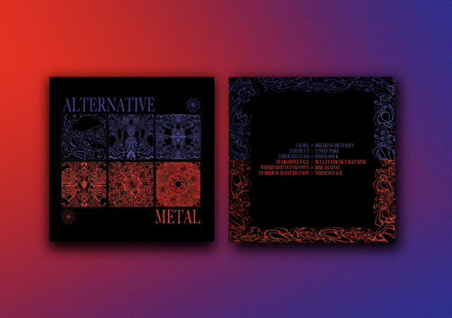
 RECORD COVER DESIGN I made the improvements that I mentioned before, the increased margins on the back of the record cover looked a lot better. I did not want to interfere too much with the font size because then the legibility would have been compromised.  I was really surprised by the horizontal colour split. I did want it to work for the sake of continuity however, I never expected it to look good.  Nevertheless, both Bradley and I really liked the design and how well it looked beside the front cover. It meant that all the designs and type were justified and uniformed. I am really happy with this design, I feel like it encompasses Alternative metal and has a very refreshed design compared to a lot of album covers and merch already existing for this genre BEANIE DESIGN  We did not spend much time on the design of the beanie as it was merely an extra piece of promotional material for the genre.  We came to this outcome very quickly and I like how the design elements from the album co

(B6) DISCUSSION WITH BRADLEY GOMERSALL

Image
Bradley and I had a discussion on where to go with the project because it was getting close to our selected deadline and design boards needed to be completed. We began by discussing the record cover design which had been my primary responsibility.  This was my favourite design and as a fan of this sort of music, it would be the sort of design that would catch my eye. I also think the photographs go very well with my chladni patterns because of the two-tone colour scheme. This was Bradley's preferred design because he liked how you can see the divide in the sides of the record together rather than back to back. He also liked the fact the Chladni patterns were the focal element on the front of the record. We both agreed to go with Bradley's choice but, I said I wanted to try the horizontal split in colour on the back so it was more uniformed with the front. I do not think it will look as good as the original but, I want to try it still. I also want to make the type smaller so the

(B6) POSTER DESIGN DEVELOPMENT

Image
We have not spoken about which record design we will be going with as of yet so that will have an effect on the chosen poster design. This design is very similar to one of the records I had designed on the previous page which goes against what I have been saying about avoiding a regurgitation of the record design As a separate poster design, I think it is interesting and I am trying to picture how someone who listens to this genre would want the poster to look like  I referenced my cymatic research where they spoke of how the sand moved to the state of "chaos" whilst moving between frequencies I used that here with the idea that Alternative Metal is constantly shifting in style, from song to song This poster design is much more simple and can be used as one poster but the back to back design or a set of two  I did this to continue showing the separation between both sides of the record  As before, I kept this separation theme for the next load of poster designs  I thought it

(B6) BEANIE DESIGN DEVELOPMENT

Image
During the development of the record sleeve design, I had made this decayed label with the genre logo on it. Straight away I thought it would make a good tag on our beanie I asked Bradley what he thought and he suggested adding his frame design to the brim of the hat, red on the outside and purple on the inside (so it is reversible) I tried what Bradley had suggested and the outcome looked interesting. There are not many beanie's that I have seen that have so much design on them so, I hope this will make it stand out We discussed this design again and decided to revise the large label and widen the banner so it filled the majority of the brim  We both preferred this design to the others and it emphasises the flower being the logo but not the actual design Bradley wanted me to try and make the label wrap around the brim. This would look tidier and probably work better for the reverse side  This was the end result, I like how the designs show the brand identity without having to plac