(B6) FINAL DESIGNS/ OUTCOMES
RECORD COVER DESIGN
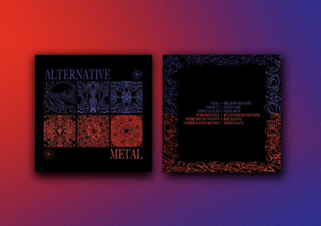
- I made the improvements that I mentioned before, the increased margins on the back of the record cover looked a lot better. I did not want to interfere too much with the font size because then the legibility would have been compromised.
- I was really surprised by the horizontal colour split. I did want it to work for the sake of continuity however, I never expected it to look good.
- Nevertheless, both Bradley and I really liked the design and how well it looked beside the front cover. It meant that all the designs and type were justified and uniformed.
- I am really happy with this design, I feel like it encompasses Alternative metal and has a very refreshed design compared to a lot of album covers and merch already existing for this genre
- We did not spend much time on the design of the beanie as it was merely an extra piece of promotional material for the genre.
- We came to this outcome very quickly and I like how the design elements from the album cover, work as assets to the other designs but, re-shaped and designed to be fit-for-purpose.
- The main interesting element to this design is its reversibility, to show the scale of Alternative metal. But, it also meant we did not have to represent both sides (soft and heavy) in one place as the beanie isn't exactly the largest canvas. It would have been very simple and boring if we had only placed the logo on it.
- The patterned banner is the same for both of the colours to show a middle ground
POSTER DESIGN
Bradley's evaluation
The idea to portray a more vulgar and rude tone stood out. The public views the fans as menaces and heathens, so its often that the fans and musicians live up to that stereotype out of spite. The poster decided to follow that route, but rather being blatantly rude, it was decided that it should be more commercially viable and friendly and so it was censored, using the consistent logo to replace the ‘U’ worked incredibly well for this.
- I am not quite sure what Bradley is referencing here and I am not sure it relates directly to alt-metal (however, this might be refering some research he has done?
- We had a discussion about the final deliverables and I had said I thought this was the poster he should develop
- However, I did mention that he should change the manipulated text to some other imagery because the relevance of manipulated type seemed very random
- I do not think he has read my research on the Chladni patterns because his approach does not seem justified through my research
- Also, the type is very different in appearance to mine, I am assuming he has not edited the characters in 'big carson' but, that is my fault for not communicating that
TAPESTRY DESIGN
- When we discussed which poster we should develop for a final design, this one was the favourite. However, that would mean Bradley would only be designing the shirt
- Bradley had suggested using his designs as posters and mine as tapestries, which I agreed to at the time
- Now I thought about it, it seems random and irrelevant to include tapestry designs for the sake of it so, I chose to not include them as final deliverables.
- However, since I have found it extremely difficult to communicate to my partner. I will be using these as my final poster
- I believe my design is fully justified and is uniformed to the other deliverables and I do not think Bradley's does
- I think it is good that these designs highlight the chladni patterns up close and I can imagine them on somebodies wall
LONG SLEEVE SHIRT DESIGN
Bradley's Evaluation
With most shirts are worn by fans of the genre, there is usually some kind of back design to accompany the front design. It was decided that this should be the case for this shirt as well. Without looking too hard at the genre it stands out that the music can often have vulgar and rude messages. This was developed into the shirt, by having the purple colour feel calming and legible. In contrast, the heavier music (red side) be more distorted and ‘brutal’.
- Similarly to the poster, I am not sure what Bradley is referencing in his evaluation because he does not mention much of his research and I thought we were focusing on one theme (the scale from soft to heavy alt-metal)
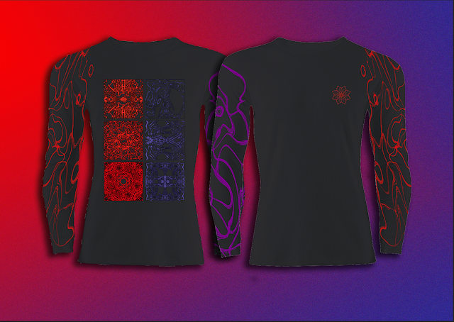
- I also thought the mock-up was awkward and made the design look poor quality
- I decided to mock the design up myself as well as trying out the layouts I had suggested to Bradley previously
- This mockup was a lot more in line with what I imagined and is a black shirt instead of grey which matches the other deliverables
- The first development used the same typesetting as the back of the record cover but, I did not like it and wanted to keep close to the original design
- I made it bigger and added type. I wanted to have some text that was just the genre name. I thought this quote was interesting and links with the Chladni experiments. I used the logo as a censory for the explicit work. I tried it as three asterisks first but, preffered it as a replacement for the 'U'
- The horizontal split would not have worked as effectively on the shirt but, I think the vertical split (making use of both sleeves) made for an interesting design
- I would have preferred on not using the design from the front of the album but, I suppose it did work for the back of the shirt, it also reminds me of the Twenty-One Pilots album cover and shirt design below
- The brief asked us to design the branding and promotional material for a microgenre of music, I believe our responses do just that.
- We have designed a more, refreshed, design concious set of outcomes to positively promote Alternative Metal. Many bands associated with the genre, use the dated aesthetics from the past which no longer works for the modernised music industry.
- The music is timeless and therefore, so does the design. The more successful bands such as Bullet for my Valentine and Linkin Park, have a lot more timeless designs which probably aided to their success.
- There was a lot of consideration on style and fashion with regards to the beanie and the shirt. They are meant to be worn by fans so not only had to work as promotional materal for the genre, but work singularly as a garment that people want to wear
- The chladni plate research was the key to the general design assets. As you can see above, it is becoming more prevalent to use pattern and texture in design for music than the original collage or photographic designs


Comments
Post a Comment