Posts

Showing posts from October, 2020

FIVE THINGS I HAVE IMPROVED THIS YEAR

My time management has massively improved, by devising a timetable early on and being strict enough with myself to keep to it  One thing that always came up in my things to improve was looking at contemporary design, this year I have actively been looking at the websites and texts that have in the past been suggested and its already really informing my work  I used to write so much work for one piece of research that used to take so much time and made it so I struggled to get a range of research and experimentation, this year I have been a lot more concise and already produced a lot more research than I did for say two projects put together last year  With my design work/ ideas, I have been a lot more confident and allowed myself to experiment rather than shut it down straight away  My attendance has improved a lot, (apart from two weeks isolation which I could not help), I have engaged so much more, attended all of my tutorials and lessons 

(B1) ZINE LAYOUT SKETCHES

Image
 

(B1) PAIR CRITIQUE WITH RAISA

29/10/20 Both discussed the research we have found and what other considerations we need to think about  Thought about the distribution of the zine and where it will be in the real-world, we said it would make more sense being a digital zine for accessibility  Raisa suggested each page of the zine should be reserved for each individual symptom of BPD, which there are nine of so, we said that we should work on four each and come together to design the last one  We tried thinking about how to justify the layout and what facts we can use from the research, mostly looking at what statistics are relevant to our design but, would benefit the design also  Raisa has been mainly experimenting with type and I illustration and we both agreed having a mix will actually be better because a word used to describe BPD is unpredictable We both will come back together Saturday (31/10/20) to see how the designs are coming on and whether they still fit the zines purpose Raisa: An i...

(B1) DIGITAL SKETCHES AND POSTER EXPERIMENTS

Image
Tried digitally painting this sketch to see if it would look good in colour, however, I did not like it and we wanted to keep to the black and white colour scheme we decided earlier I did think the red strip worked but, I think its because its a contrast to the rest of the drawing- which was the point I do also think it looks better with a black background opposed to the original white So, after showing Raisa and getting her opinion, I tried the strip inverted because we both agreed that black and white was a concrete rule in our design process but, the strip would look better as a contrast Both of us thought this had a better appearance to the coloured version and kept to our rule I also thought it would make it easier to apply to a poster or zine There are so many things that I do not think are effective in this poster. For one, the type being so big takes the attention away from the illustration and looks like it has been clumsily placed on there without much thought. A second thing...

(B1) SKETCHES

Image
I tried to illustrate the struggle of not being able to switch off at night. It is something I constantly suffer with, as well as many people. This has caused me to sleep around two hours a night and can be hard (although fairly used to it now). I was not sure how to show this and just drew what came to mind. I usually have a more photorealism approach but, I wanted these to be quick, almost comic like images. The more I look at this one, the more I do not like it, it is not really my style and would not be something I want to put out in the world.  This illustration was much different and I was far happier with it. It has that comic appearance that I wanted and I think it accurately depicts that mask we put on ourselves to tackle the day. The shapes also gave it a little more direction, I can see how I can develop it already whereas in the last illustration I did not.  I tried to keep the style of the last illustration when drawing this. I suppose out of all three this one is...

(B1) DESIGNING OUT SUICIDE

Image
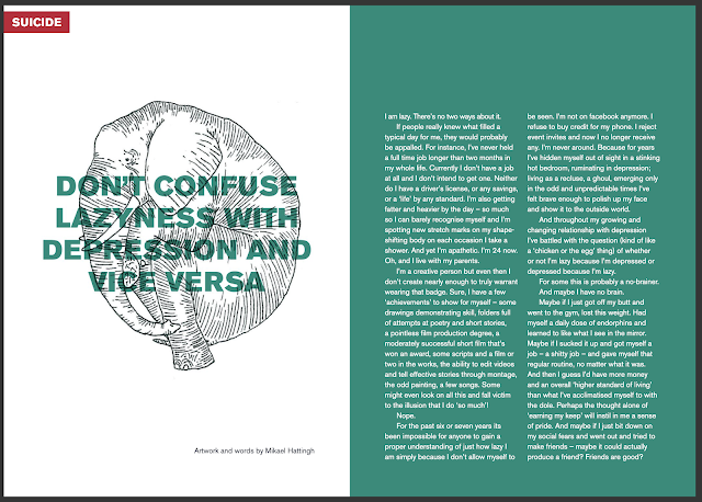
Digital Zine  Works on a submission basis, so any individual can submit their story and art, for a chance to get in published into this zine Because of the above point, each spread has a very personal design, whether it be photography, illustration, graphic design etc. Only consistent element is the type setting monochrome background of the type Specifically aimed at women's mental health  One thing both of us noticed about this zine is the interesting topics it discusses, for example, "Happiness or Mania", because many preconceptions of BPD, is that you are hyper, and super happy. However, in most cases it is an episode of sorts where you are in an extreme high and very impulsive, which leads to risky behaviour and disassociation.  Similar to Dolls Hospital, the illustrations provide that need for an even more personal level of communication. They make the reader feel the atmosphere of the article and sometimes an illustration or photograph is more relatable than wh...

(B1) SHIT'S FUCKED: A POSITIVITY GUIDE (ZINE) BY GINA SARTI

Image
Published zine  Travel size  Two- tone Comedic  A positivity guide The front cover is the only example of image in this zine, the rest is all textual information. This has a similar purpose to acclamations however, it uses mindfulness tips to help someone feel more positive or even take a break away from every day chores. The double spread above is a good example of mindfulness techniques that are advised by councillors and therapists, except the book is a small $3.99 which is nothing compared to the prices of said therapists for many people in different countries. Also, being travel sized makes it easy to grab out of your bag whenever and wherever you are.  The front cover homes a dark illustration of a house on fire but then accomplies it with the comedic title, shining a little light on a "shit situation". 

(B1) DOLL HOSPITAL ZINE BY BETHANY LAMONT

Image
  Digital zine A mix of type and illustration Aside from the illustration, two-tone colour Some hand-rendered type Bethany Lamont designed this zine targeted at people struggling with their mental health with the notion of "surviving and thriving". This was influenced by the lack of material out their that her family and herself needed to hear so they took it upon themselves to publish Doll Hospital . I think the entanglement of illustration and type works well because the images tell a story of their own, adding a more personal context that the text does not do. Plus, I think it something people can find more engaging rather than constant text, one of the main problems with mental health is the lack of motivation, this zine allows the reader to enjoy it whether they read all the text or not.  With it being digital, it is accessible to people all over the world and not just her local area. I think that is a really important consideration for Raisa and I because apart from eac...

FRANK OCEAN- BOYS DON'T CRY

Image
  Another musician, Frank Ocean, decided to design a magazine for his music in 2016 It celebrates a lot of black male musicians and most of the imagery has been contributed by other big names like Kanye West and Tyler the Creator The imagery throughout is interesting and shows much inspiration by many artists  The front cover design is amazing to look at and really draws you in as a reader Campbell, G. (2020) Here’s a Look Inside Frank Ocean’s ‘Boys Don’t Cry’ Magazine. Highsnobeity. Available at: https://www.highsnobiety.com/p/frank-ocean-boys-dont-cry-magazine/ (Date accessed 28th October)

BEYONCE'S LEMONADE

Image
  Similar to Radiohead, Beyonce produced a film to spotlight her sixth debut album, Lemonade This album was a huge step in her career, in general her music has always been targeted at everyone and even though it has referenced problems in the past, it has always been light pop anthems that just nodded at the notion of these problems  This album really focuses on the problems she has faced in a lot more of an aggressive, reflective and real- talk manner This album as opposed to her others, did not trade in as generic pop but highlighting life as a black woman in America Praising customarily black facial features and hair types throughout the majority of songs and referencing the food she grew up with  Many people found this sudden change in her output a shock but also praised her now more personal approach to her music and her now more hard-hitting way of expressing herself. The fim did very well and her fanbase became stronger than ever. It allowed them to see her an...

INTRSTLR

Image
An app that aims to spotlight musics unsung heroes, the faces behind the amazing guitar riff or the person behind the mixing track on a song What the app does is syncs with whatever streaming service you are using to see the music you are listening to, from that it generates these "constellations" the blue ones being the artists you like and are aware of and the yellow being the unsung heroes. It then allows people to get in contact with these unsung heroes so they can gain more recognition and play as solo artists rather than under the shadows of the greats  I like this as an idea but, it has a very specific focus. I was thinking of an app that would work alongside a streaming service such as Spotify. Obviously, my own design would have more of a focus on the relationship between music and design rather than artists and listeners. Stevenson, J. B. (2016) INTRSTLR. Medium.Available at: https://medium.com/the-open-music-initiative/intrstlr-56333cfbba39 (Date accessed 28th Oct...

RADIOHEAD: POLYFAUNA

Image
  Radiohead design a Virtual reality experience where the listeners can use and manipulate the VR in a natural environment Poly fauna meaning triangular shapes/ atmospheres and plants  It allows the user to engage with music and design together in a unique way. Using the tool to also explore the outdoors rather than being stuck inside on a screen. It is like a microcosm for what the music industry has become with the beginning of streaming services  Is a good idea as to how I could create something to strengthen the relationship between music and design and its audience  The colours and shapes are really interesting and it does make you want to interact with it. Even though it appears simple, the shapes move in a dynamic way to fit the environment it is targeted at and the song playing. This is the sort of thing I was thinking at the beginning of the project and this really is pushing me in that direction. However, I want to try and think of something else that could...

MIT MEDIA LAB: TOWARDS NEW MUSICS: WHAT THE FUTURE HOLDS FOR SOUND CREATIVITY

 READING NOTES The Prospects of Recording, Glenn Gould (1966), set out to revolutionise the dreary elevator music into something that enriched the ear drums. Gould thought that suscepting people to this "background music", could train listeners to be more sensitive to their surroundings, including the structural forms, buildings and hidden meanings of music.  However, this did not pan out for him, later the magnetic tape recording was born which, allowed for songs to be recorded and distributed on a wider scale  Streaming music and music distributed via the internet has become the "elevator music" of today The fact they offer endless songs and create playlists for the customer based on thier likes is downgrading music's potential to create something new, instead its just generated sounds following a trend.  Could there be a way to use the fluidity of streaming services and music to create something different? Something that will evolve the more you hear it? Like...

BJORK DIGITAL

Image
Musician Bjork created an immersive virtual reality exhibition which has been held by several venues, including Somerset House in 2016 Bjork has always been known to push boundaries and this exhibition did exactly that, it brought together music, design and technology The exhibition is based around the immersive film for her song Black Lake directed by Andrew Thomas Huang , where the audience experienced panoramic visuals surrounding them as well as the song playing Huang also collaborated with Bjork on Stonemilker VR, project attributed to the first track from her Vulnicure album The windswept beach featured in the VR is viewable in full 360- degree VR, making the viewer experiences a one- to- one recital Jesse Kanda directed Mouthmantra VR , which was an intense capture of the inside of Bjork's mouth during her singing the song This looked alien of sorts and not human  Warren Du Perez and Nick Thornton Jones directed the VR for Notget where, Bjork is presented as a giant digital...

ESSAY STRUCTURE

INTRODUCTION  Paragraph One (300 words) Explain the question Looking into the relationship between music and design  How this has been impacted by the advancement of streaming services  Contexts: How this has translated into historical context, social context and technological context  SECTION ONE: The Early Days Paragraph Two (Try to keep this between 150) Sheet music was the first form of recorded music, only really useful for those who could practice it  However, even though people had to travel to listen to music, this actually made people more inclined to learn it There was not a noticeable amount of design at this point however, sheet music came as pages or publications and later on and were made by designers, noting that graphic design was not a named thing at this point however, the visual language and principles were still being applied Mention this effect on the consumer, how they interacted with music at this point and applying a phenomenological appr...

(B1) TYPOGRAPHIC MENTAL HEALTH POSTERS

Image
Vast colour palette across all the posters  Type manipulation and experiments Psychedelic patterns  Very cyber generated looking designs Even though there is no uniformity between the type, colour and patterns in each poster, you can tell they are part of the same series. I think this is because of the manipulated type and the fact that all the patterns, although different, have these vivid colours and shapes within them. Each poster has had a lot of consideration, the "Happy" and "Numb"  posters, it is mostly two tones. the two extremes, when you are happy, you are happy etc. However, "Manic" and "Paranoid" in particular, have a lot going on, the colour and patterns are a lot more wild. The type on the "Manic" poster, not only has a contrast of temperature with the colour choice, but it also has its own pattern. This poster was the hardest to look at because there is so much happening which was appropriate for the word.