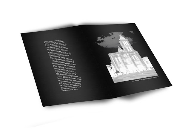
(B5) FINAL OUTCOMES/ DESIGNS
After designing the embellishments and illuminated manuscripts, I made sure the continuity of design and typesetting had been maintained throughout every page. The main issue I had with the design of this zine was the title pages. I was happy I could use the large illustration for the "The Key features of gothic architecture", it just seemed right for it to be there. Then for the styles of Gothic Architecture, I created a visual timeline that used the curvilinear line like I had for the map later on for the "Gothic architecture in Leeds".
The zine brought together all of the best parts of the project into one place. Like the Gothic Architecture infographic I looked at in my research, I think the zine is a modern and professional design that will encourage young people to appreciate Gothic Architecture in Leeds and know more about it.


Comments
Post a Comment